

BLOG – no.10: The Rule of Thirds & Beyond: 5 Easy Composition Tricks for Stunning Shots
If you’re new to photography, you’ve probably caught yourself centering everything in your shots. It’s the easiest instinct to simply put your subject in the middle and click. But here’s the thing: the difference between a quick snapshot and a captivating photo often comes down to composition.
Composition is the art of arranging elements in your frame to create visual balance, flow, and emotion. Once you start composing with intention, your photos will instantly look more professional and engaging.
I know that I have briefly touched on this subject in previous Blogs, but this is a more in-depth look at composition and the rule of thirds.
Here are five simple photography composition techniques you can start using today.
1. The Rule of Thirds – The Foundation of Great Composition
Imagine your frame divided into nine equal sections like a noughts and crosses board: three across, three down. The Rule of Thirds says to place your main subject along these lines or at one of the four intersections. This is obviously a rough guide as depending on how big or close to the lens your subject matter is, this might not appear to be possible, and then its a case of having to align the center of your object to that line (as shown below):
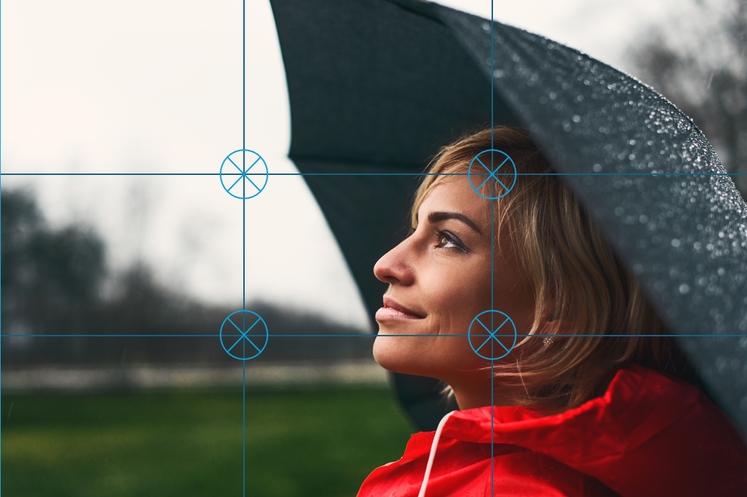
Rule of Thirds Grid - Showing the 4 intersections.
And instead of putting the horizon in the middle of the picture, try aligning it with the top or bottom third of the frame. If you’re photographing a person, position their eyes closer the upper third line. This creates balance and flow that feels natural to the human eye.
Pro Tip: Turn on your camera or phone’s grid feature to help you compose with precision.
2. Leading Lines – Guiding the Viewer’s Eye
Lines are powerful visual tools. Roads, fences, rivers, and even shadows can act as leading lines, drawing your viewer’s eye toward the subject or through the scene.
Use leading lines to add depth and direction, they make the viewer feel like they’re traveling into your photo rather than just looking at it.
For example: If you framed a road up in your shot disappearing off into the distance over some hills, then you can line up one or both bottom corners of the scene. This is where the leading line of the road draws the viewer into the picture as our eyes naturally follow the shape of the road into the scene. But remember the rule of thirds and keep the sky as roughly the top third and the landscape as the bottom two thirds (obviously it is difficult when your horizon is mountainous and not flat, as demonstrated below:
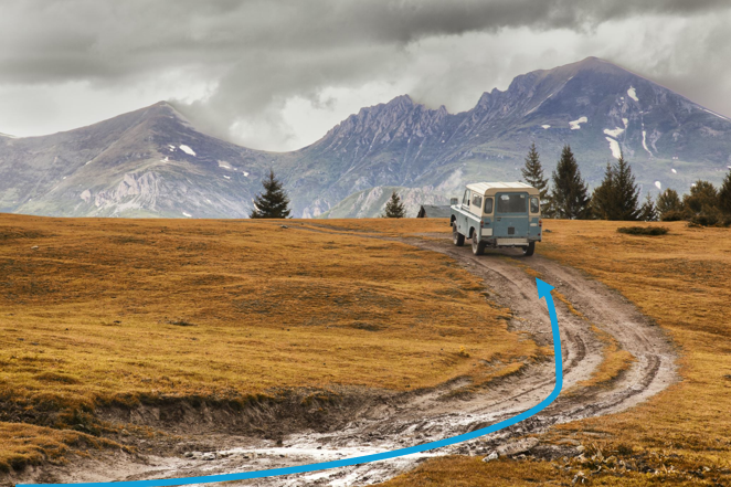
An example of a leading line: The road acts as the leading line from the bottom left corner…
3. Framing Within the Frame – Add Depth and Storytelling
Find natural or architectural elements that frame your subject like doorways, arches, tree branches, or windows. This technique adds dimension and context, helping to focus attention on the subject while adding a sense of story to the shot.
For Example: if you were using a window to frame your subject, then stand back enough to capture all sides of the window frame. It is rare that your subject will be exactly perpendicular to the frame you are using, but make sure that all of your subject is visible in the frame:

An example of using a window to frame your subject…
4. Symmetry & Patterns – Breaking the Rules Beautifully
Sometimes, centering on your subject is the right choice. Symmetrical compositions like reflections or architectural patterns can be visually striking. Patterns and repetition also create rhythm and harmony that are pleasing to the eye.
For example: To get a reflection of these trees across a small lake, the horizon needs to be roughly in the middle of your shot. Ideally, you need to be close as possible to the water to get the best results.

A reflection in a partly frozen lake…
The secret is intention. Break the rules only when it makes your image stronger. Sticking to the rule of thirds in the above example would lead to either cutting off part of the trees in the shot, or the reflection. Or zooming out to further distance, and then having the trees and their reflection too small and distant in your image.
5. Negative Space – The Art of Simplicity
Negative space refers to the empty areas around your subject, like a clear sky, a quiet beach, or a minimalist wall. When used well, negative space helps draw attention to your subject, giving your image a sense of calm, balance, and sophistication.
That said, too much empty space can make a photo feel sparse or unfinished. The key is to find a happy medium give your subject room to breathe, but not so much that it seems lost in the frame.
For example, if you’re photographing a person standing at an angle and looking to their right, position them on the right third of your frame. This gives them space to look into, which feels more natural and visually balanced (the picture of the lady in a red jacket in section 1 above, is a great example of this). The same rule applies to cars, animals, or anything moving, and giving extra space in front of the subject implies motion and direction. On the other hand, placing your subject so they’re facing out of the frame with lots of space behind them tends to feel awkward. Our eyes naturally follow the direction something is moving or looking, not where it’s been.
In photography, less really can be more. Sometimes, objects in your scene like a street sign or a rubbish bin can’t be avoided. Luckily, modern editing tools and AI-based software make it easier than ever to remove unwanted distractions and clean up your shot afterwards.
Pro Tip: Create Separation - Always try to create separation between your subject and the background. For instance, in a portrait, you don’t want a lamppost or tree branch sticking out of someone’s head. If you can’t find a perfectly clean background, increase the distance between your subject and what’s behind them.
You can also open up your aperture (use the lowest f-stop number available on your lens) to blur out the background and make your subject stand out. This simple adjustment gives your images a more professional look and helps direct the viewer’s attention exactly where you want it.

An example of using a distance and a low aperture to separate of your subject from the background…
Final Thoughts
Mastering composition is like learning the grammar of photography. Start with the Rule of Thirds, then experiment with lines, frames, symmetry, and space. The more you play with these principles, the more you will develop your own visual style.
Remember: great photos aren’t just taken, they’re composed.